
When I started making web sites, the typical programmer stuck their entire site inside a monolithic table to layout their site and called it a day. Now, your site is competing with tons of others just like it for a slice of your user’s attention. Plus, your user’s time is limited. They’re looking for a single excuse to leave your site. If it doesn’t appeal to them, they leave.
Your site can no longer afford to have “programmer design”. Here are some of the fundamentals I’ve learned over the years to keep my designs looking professional.
I have to confess: my eyes are quite terrible. Not only am I red-green color blind, but my doctor described the shape of the front of my eyes as “a fat football”. The thing is I’m not alone. 1 in 10 men are color blind and 75% of adults use some form of corrective lenses.
Making your site hard to see for these people means you’ll be relying on people to,
ctrl + a couple of timesNot only do you have to worry about vision impaired people simply being able to see your site, you need to worry about normal people’s first impression. We know from various studies that users make a sub-conscious reaction to your site’s design in 50 milliseconds. To make the best impression possible, you need to increase your site’s “scan-ability”. Your users should be able to give your site a once over and understand what it’s about in less than a second.
If your page takes longer than a second and a half to load, stop reading this and fix that immediately. You’re losing users by the truck load.
The solution? Make everything on your page bigger, everything. It’s a common problem I see with programmers when they design web pages is that pretty much every item on their page is too small. From buttons, to headers, to body text.
Here’s a few simple guide-lines to help reduce the amount of users who leave your site,
Remember, these are just guidelines. If your specific situation requires you to break one of these, then go ahead, but have a very good reason in mind.
And here’s a fun video with more on this subject,
Your task when creating the design of your body text is to make reading as easy as possible. Thankfully, typography is has been around for hundreds of years, and there exists a very simple set of rules you can follow to achieve readable text.
While I briefly covered body text in the last section, your body text is what your users should be focusing most of their time on. So, it makes sense to focus more of our design time on this as well.
Look at the following two paragraphs,
Apparently we had reached a great height in the atmosphere, for the sky was a dead black, and the stars had ceased to twinkle. By the same illusion which lifts the horizon of the sea to the level of the spectator on a hillside, the sable cloud beneath was dished out, and the car seemed to float in the middle of an immense dark sphere, whose upper half was strewn with silver. Looking down into the dark gulf below, I could see a ruddy light streaming through a rift in the clouds.
Apparently we had reached a great height in the atmosphere, for the sky was a dead black, and the stars had ceased to twinkle. By the same illusion which lifts the horizon of the sea to the level of the spectator on a hillside, the sable cloud beneath was dished out, and the car seemed to float in the middle of an immense dark sphere, whose upper half was strewn with silver. Looking down into the dark gulf below, I could see a ruddy light streaming through a rift in the clouds.
All I did was change the font size to the default and lower the line height. And look how much harder it is to read.
Now, here’s my list of must do’s and don’ts in body text.
Anything less is too much visual information in too small of a space. But the line height probably shouldn’t be much more than 2
It may look pretty but it’s harder to read and doesn't make much sense on the web. Avoid it and stick to left aligned.
I’m sorry, what?
It’s an interesting rule of thumb typographers use. Body text should never be more then three alphabets wide. Meaning, if you type out a-z three times with no spaces, no more text should be able to fit on one line. Anything more makes it hard for the eye to follow from line to line.
You’ll often hear people say “Use serif for your body text and sans-serif for your titles”.
For those that don’t know, the text you're reading now is in what’s called a serif font, meaning letters have little “feet” on the bottoms of them. The headers on this page are “sans-serif”, meaning “without serifs”. They don’t have the little feet on them and tend to look more “clean” while serif fonts tend to look more professional.
Serif or sans-serif doesn’t matter as much as people think it does, but when in doubt, serif for the body and sans-serif for headers is easy rule to follow, which somewhat works because it presents people with a familiar design, and people don't like things that are different (not joking, why do you think the save icon is still a floppy?). Also new and shiny font choices matter much less than people think. Using just the fonts already installed on your users’ browsers, you can make a very good looking site.
Finally, it's a good idea to stick to using just two fonts across your entire site. Using more can make your site look too eclectic.
Here’s some simple CSS to use all of these rules
p {
    font-size: 16px;
    font-align: left;
    margin: 1em 0; // give your paragraphs some breathing room
    font-family: Georgia, serif; // simple, fast, and works on every browser
    line-height: 1.65; // this is my preferred size
    max-width: 680px; // just about three alphabets
}
A black and white website isn’t much to look at. Unless you’re going for a Zen or ultra minimalist design, adding a bit of color to your site can really bring it off the page.
Because your reading an article for programmers, I’m going to assume we could both use a little help when it comes to color theory. In situations like this, I like to use tools that graphic designers have created to help people like you and me. My favorite by far is Paletton, which has very helpful features like a CSS export option.
Paletton allows you to choose between different styles of making color schemes by clinking on the different circles with dots at the top. These are based on the user choosing a primary color which decides what your secondary colors will be.

For now, stick with either the first or second one. Choose your primary color by spinning the dark circle around the color wheel. It’s best to pick a cool color, meaning a color between magenta and light green, as your primary color. Cool colors are pleasing to the eye while warm colors (reds, oranges, and yellows) are motivators to do something. This is why companies like the most popular websites (Twitter, Facebook, Reddit) use blues as their main colors and red or orange for things that go wrong or for notifications.
Have you ever heard of the Reddit slang “orange-red”? It means “message”, because
the message icon changes to the color orange-red when you have something
in your inbox. This color decision was so effective that the site’s users came up
with and regularly use a new word.
To choose a warm color to go with your main cool color, flip the switch at the top that says “add complementary”.
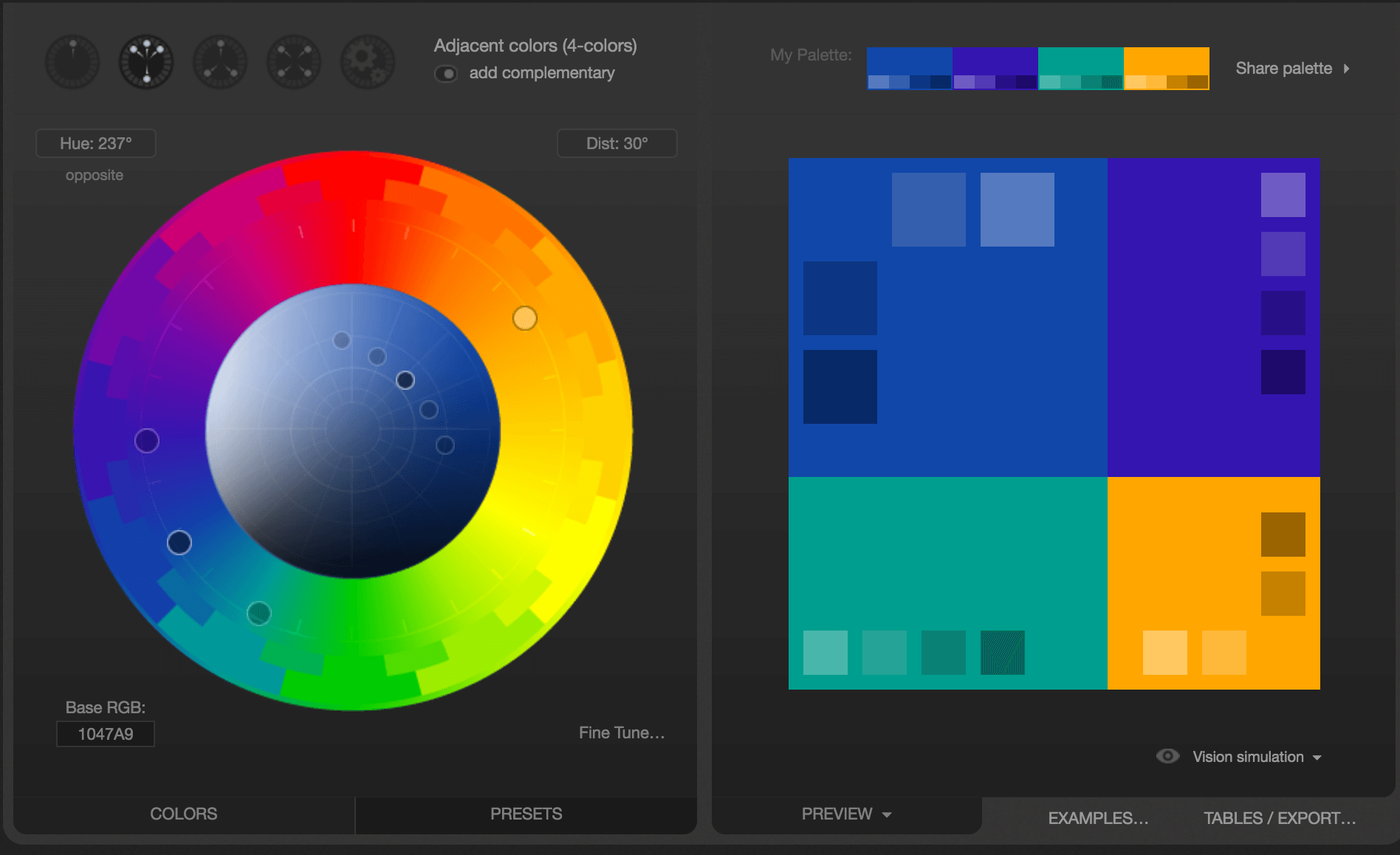
Now that you have your colors, hit “export” and the get the list as CSS. Use your primary color as your navigation and primary button color, and throw in your other colors for notifications, warnings, and other buttons.
Your site now has a consistent look and feel to it.
Some parting words:
Now you’re all set to making a decent looking site! And you didn’t even have to spend tens of hours in a web design course.
Questions or comments? Feel free to contact me.